The Environmental Visual Communications 2018 Cohort created a campaign that called for the public to "give back to nature." We wanted to promote a movement that encouraged people of the public to take a moment out of their busy days and reflect on what nature provides for them and how they could show their appreciation. We presented this campaign at the Rouge Park Fall Festival 2018 over the weekend of October 13-14 in Toronto, Ontario, Canada.
I created the colour palette and pieced together our branding guideline as found below.
I created the colour palette and pieced together our branding guideline as found below.
Process of Creation
As a group, we had discussed the goals of our campaign and what we wanted it to represent. This year throughout our Environmental Visual Communications program, we were fortunate enough to work with the Royal Ontario Museum’s Indigenous coordinator who taught us about Indigenous history and through different case studies, we learned of Indigenous communities’ roles in conservation through Traditional Ecological Knowledge.
Because of those classes, we often discussed reciprocity: How we can show kindness by acknowledging what nature gives to us and how we can give back. We wanted to show this concept with our logo for this campaign by including an infinite symbol.
Because of those classes, we often discussed reciprocity: How we can show kindness by acknowledging what nature gives to us and how we can give back. We wanted to show this concept with our logo for this campaign by including an infinite symbol.
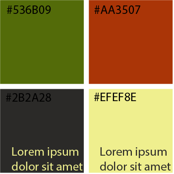
Once we had a logo design, we began to discuss colours. Because we would be presenting at Rouge Park for their Fall Festival, we wanted to incorporate an autumn feel that could also be used during other seasons as well. As a team, we decided on an olive green and rusty orange. The green was an obvious choice to represent nature and growth. We also wanted a warmer colour to compliment the green. We quickly became inspired by the changing leaves of fall and decided on a darker shade of orange to still represent energy and draw the eye.
I then explored with exact shades, saturation, and hues until the group was happy with the right combination. We also wanted to include shades of dark gray and a pale beige for more contrast, but we chose to only include black and white to stay minimal and save on printing costs.
I then explored with exact shades, saturation, and hues until the group was happy with the right combination. We also wanted to include shades of dark gray and a pale beige for more contrast, but we chose to only include black and white to stay minimal and save on printing costs.
Once we made all the decisions of the campaign’s design components as a team, we broke up into smaller groups to draft pages of the branding guideline so that I could independently use all the drafts to produce a final branding guideline that the rest of the class could use.
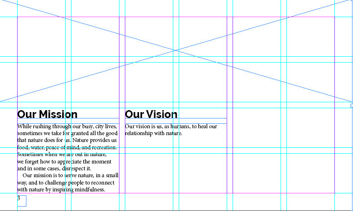
Using InDesign, I first created empty pages with grid guidelines so that I would already be able to envision how everything would be placed. I experimented with placeholders for both text and images.
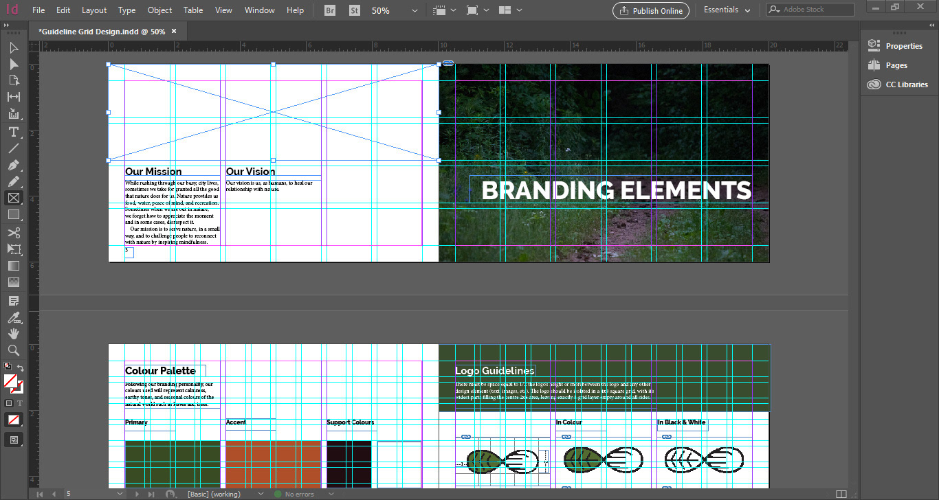
For the purpose of this campaign, we wanted to keep things simple and brief due to our 2 week time constraint to have everything done by the festival and a tight budget. Keeping this in mind, I wanted the guideline to be visually pleasing, consistent, and minimal. I included all components that were sent to me by my team and filled any extra white space with photographs that were similar to our guideline’s colour palette.